Event posters are designed with striking design to provide quick and effective information about the event. The ultimate goal of an event poster is to clearly communicate the date, time, and venue of the event.
When designing a poster, visual elements are also utilized to attract attention. Artworks featuring visual elements are easily noticed wherever they are, and people are motivated to attend the venue when they see a favorite artist on a poster.
We often see event posters on walls and billboards that are directly exposed to the outdoors, but we also encounter them in event venues or some popular cafes.
The primary reason for creating a poster with a visual focus—or even a visual emphasis is to ensure it stands out among many similar posters. Another reason, which I consider more personal and sometimes apply to my own posters, depending on budget, is the collectibility of the material, which will soon become obsolete due to the date information it carries.
Promoting an event using posters, even if you temporarily overlook the cost, remains a very popular and effective marketing method. While printing a poster may initially seem costly, as an offline marketing tool, the fact that it remains operational 24/7 is a significant advantage; it’s an essential component of multi-channel marketing processes.
Even though you spend most of your day staring at screens, constantly bombarded with notifications, advertisements, and other stimuli vying for your attention, when you see a poster of a singer you love hanging in a favorite spot in your city, you’re intrigued, excited, and want to be there where they’re performing.
In this respect, posters printed on physical material begin to express more than just information; they appeal to an emotion and create motivation. In this context, it wouldn’t be a mistake to consider event posters as part of experiential marketing.
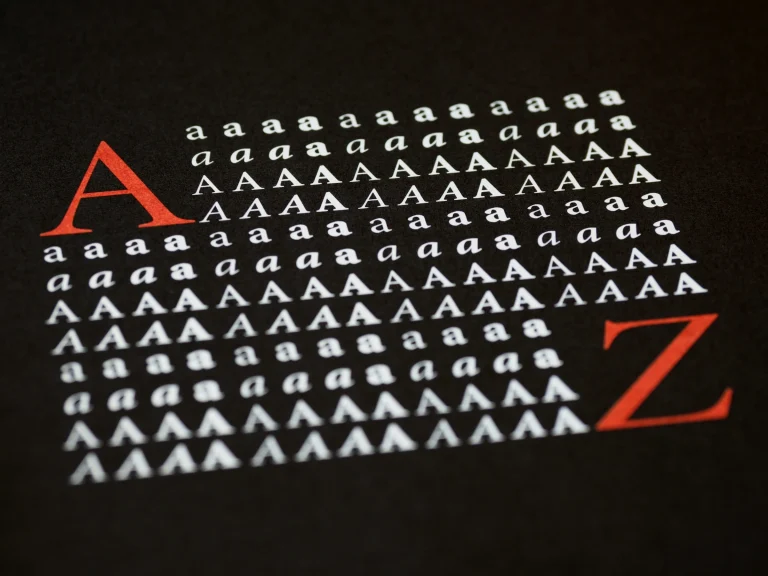
As with all graphic design work, event poster design prioritizes the concept, the use of form, tone, and color appropriate to the event’s theme, and, most importantly, readability and originality.
There’s a tradition of developing a visual language appropriate to the purpose and format of each event.
For example, a pop singer’s concert poster shouldn’t be designed with the same language as a medical conference announcement poster; each has different color palettes and typographical preferences designed to appeal to their respective audiences.
It’s important to remember that the right typography and color palette will ensure the event poster stands out from the crowd. In addition to capturing attention, the information on the poster can be easily read—and from as far away as possible.
A balanced composition enhances the visual’s engagement with the target audience and ensures a quick understanding of the event’s information.
To learn more about event poster design and see sample applications, you can download the e-paper for free from the link below.
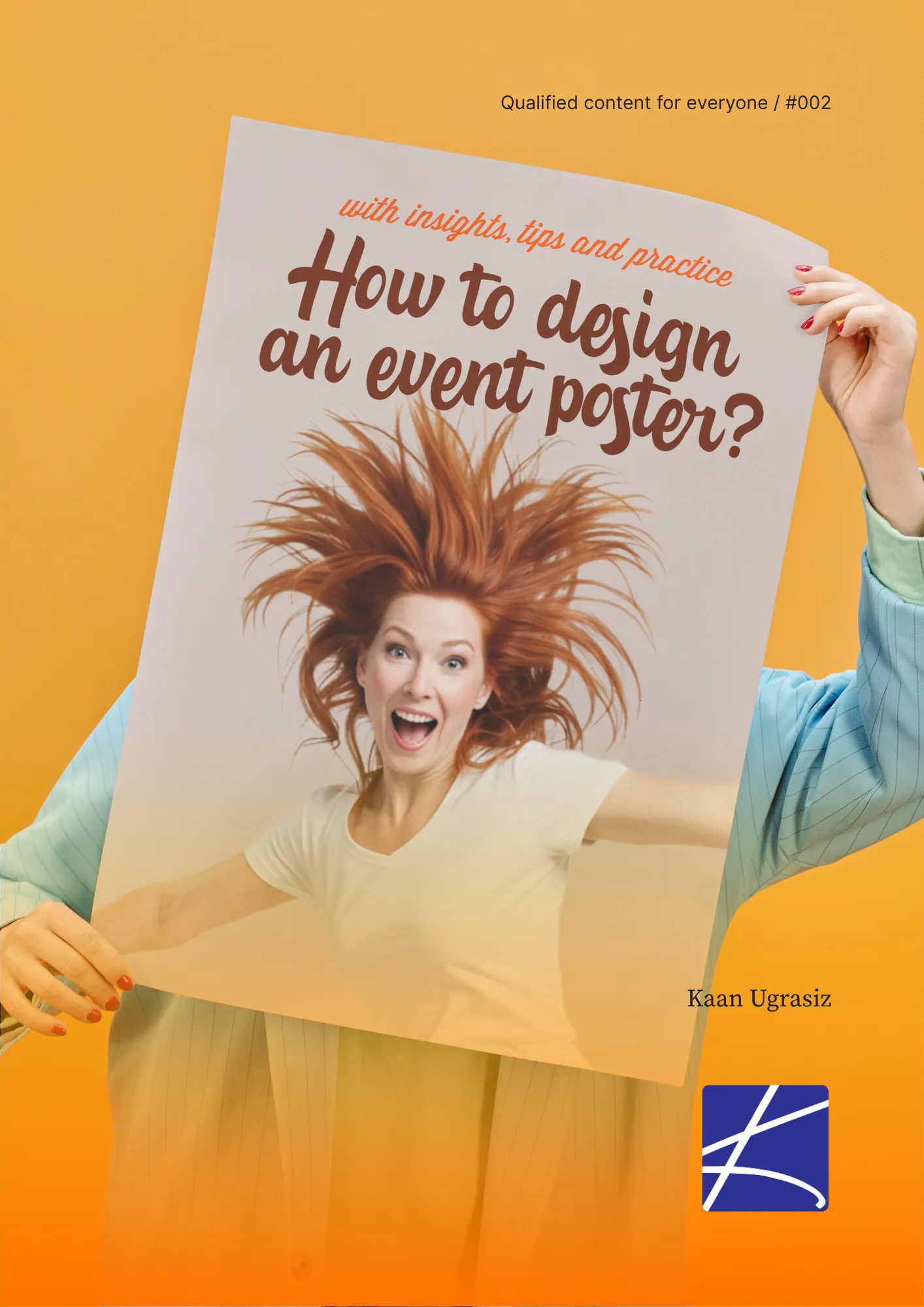
Download e-paper for free: You’re going to find these topics in this document:
- Understanding the goals of poster design
- Which poster to where?
- Selecting true poster size to true place
- Deicing on the right poster size
- Checkpoints in poster design and poster design tips
- Divisions of an event poster
- A free example of designing an event poster